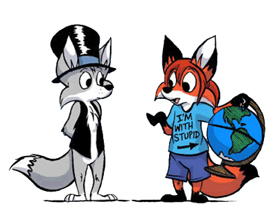
First try at coloring :)
Moderator:Æron
- Steve the Pocket
- Posts:2271
- Joined:Wed May 19, 2004 10:04 pm
Hm...just a little nitpick that always gets me. Ozy's "color line" does NOT go to his nose. It wraps up his eye and meets halfway up the eyeball. Let me show you.<br><br>Here is Ozy's picture from the cast page with color removed:<br><img src='http://www.abort-retry-ignore.net/omcolor/colorline.png' border='0' alt='user posted image' /><br><br>Now, here is the same picture with color:<br><img src='http://www.abort-retry-ignore.net/omcolor/ozy.png' border='0' alt='user posted image' /><br><br>Notice the color line. This is the path or the line (in blue) that most of you seem to follow. This is technically incorrect.<br><img src='http://www.abort-retry-ignore.net/omcol ... ine_0a.png' border='0' alt='user posted image' /><img src='http://www.abort-retry-ignore.net/omcol ... line_0.png' border='0' alt='user posted image' /><br><br>Here is the correct line (in red):<br><img src='http://www.abort-retry-ignore.net/omcol ... ine_1a.png' border='0' alt='user posted image' /><img src='http://www.abort-retry-ignore.net/omcol ... line_1.png' border='0' alt='user posted image' /><br><br>Larger images for easier comparison:<br><img src='http://www.abort-retry-ignore.net/omcolor/cl_large.png' border='0' alt='user posted image' /><img src='http://www.abort-retry-ignore.net/omcolor/ozy_large.png' border='0' alt='user posted image' /><br><br><br>Did that make sense?
<i>Hold the newsreader's nose squarely, waiter, or friendly milk will countermand my trousers.</i>
- Steve the Pocket
- Posts:2271
- Joined:Wed May 19, 2004 10:04 pm
- Burning Sheep Productions
- Posts:4175
- Joined:Fri Oct 31, 2003 8:56 am
- Location:Australia
- Contact:
- Ozymandias
- Posts:1901
- Joined:Sun Jun 20, 2004 3:21 pm
- Steve the Pocket
- Posts:2271
- Joined:Wed May 19, 2004 10:04 pm
Edited the last one a bit 'cause the phone's base color was off (I didn't even know Caigan's color for that came from an actual strip until today). Also you might notice that my methods of coloring the castle's exterior/interior are based on "Calvin and Hobbes" (he did a lot of vertical gradients like that).<br><br>And now here's two more, from a completely different place in the archives:<br><img src='http://img157.exs.cx/img157/4645/om20020115c1ra.png' border='0' alt='user posted image' /><br><img src='http://img17.exs.cx/img17/4859/om20020116c3oe.png' border='0' alt='user posted image' /><br><br>Carried away? WHO'S getting carried away?!? This is FUN! BWAHAHAHAHAAAA!!!
Just a suggestion, Octan. When the background of a panel has a badrkened area (such as the first panel on the second strip), try to make to "outside" of the gradient darker than the inside. I, for one, think that it looks much smoother that way.
<i>Hold the newsreader's nose squarely, waiter, or friendly milk will countermand my trousers.</i>
I didn't even notice that until you said it. XD<br><br>Good work btw. <!--emo&:D--><img src='http://definecynical.mancubus.net/forum ... iggrin.gif' border='0' style='vertical-align:middle' alt='biggrin.gif' /><!--endemo-->
This is addicting! Here's another:<br><br><img src='http://img.photobucket.com/albums/v238/ ... color2.jpg' border='0' alt='user posted image' />
- Steve the Pocket
- Posts:2271
- Joined:Wed May 19, 2004 10:04 pm
No doubt about it, we should both ask about contributing to HouseRules.<br><br>(BTW I noticed the problem with the first panel; how do you think I ought to change it? The tuft of grass at the bottom is why I went with the green, but what could I blend it into? Darker green?...)<br><br>Oh, and Allison, Locke's hat would look better if you shaded in a lightish gray on the highlighted edge.
Who is online
Users browsing this forum: No registered users and 24 guests

